Wednesday, 31 March 2010

Kenneth Cobonpue - Bloom Chair


With the spring blooming outside my windows, I decided to share with you something blooming as well - The Bloom chair by the amazing Fillipino desinger Kenneth Cobonpue.  Kenneth is an industrial designer known for his signature designs in natural fibres and materials. His designs mainly focus on nature's forms using rattan, buri, bamboo, and abaca (wiki).

Inspired by the graceful bloom of a flower, this lounge chair is sculpted by hundreds of fine running stitches radiating from the center of the seat creating subtle textures. Invisible supports form shapes reminiscent of soft and graceful musical tones. The Bloom sits on top of a steel base which provides a good counterpoint to its playful organic form.


Tuesday, 30 March 2010

Krakowski Kredens' Package Design


Krakowski Kredens (Krakow’s Cupboard) is a brand of products that are meant to look like they’re 100 years old …but were only created two years ago. Alma, chain of delicatessen supermarkets in Poland, decided to create a premium brand of traditional products based on old recipes and natural ingredients. The whole series was designed by Igor Banaszewski, owner of item:grafika. Simple design of the labels is completed by XIXth century photographs of a Krakow family, used on carton packaging and jar lids, and old photos of the city. Initially sold in Alma chain stores, after the success of the brand, Krakowski Kredens is now sold in stores all over the country.


Monday, 29 March 2010

Luis Luna's Furniture


Some time ago I published a couple of short posts about furniture and product design by Luis Luna - a full time dreamer, part time designer and occasional storyteller. I was impressed with his lamp made of used plastic cups  and the Heineken crate. This time, browsing through his portfolio on Behance, I stumbled upon Luis' take on the design classics: Barcelona chair by Mies Van Der Rohe and LC2 by Ray and Charles Eames. I the way he is not intimidated by the design icons, can you see how the Barcelona chair comes out of a suitcase...?


Saturday, 27 March 2010

Melanie Bilenker Jewelry


The jewelery by Melanie Bilenker features something I really like - the beauty of everyday life. Her beautiful rings and broochers show moments as ordinary as combing your hair or talking on the phone. Melanie lets you enter the most intimate moments of someone's life (is it Melanie herself?) and keep them on a beautiful piece of jewelery.

The Victorians kept lockets of hair and miniature portraits painted with ground hair and pigment to secure the memory of a lost love. In much the same way, I secure my memories through photographic images rendered in lines of my own hair, the physical remnants. I do not reproduce events, but quiet minutes, the mundane, the domestic, the ordinary moments.

Thursday, 25 March 2010

Strange Carafes by Etienne Meneau


Few months ago I mentioned the amazing handmade wine carafes by Etienne Meneau. Upon my last visit to Etienne's blog dedicated to the product, I discovered a new series called Grand Coeur / Big Heart. The previous ones looked like your vascular system, while the new ones are a beautiful representation of heart veins. Simply stunning.

Wednesday, 24 March 2010

Fleriana Package Design


There are a few graphic studios in this world I would definitely to work for. I have never been to their headquarters, I don't know their staff. But I do know their portfolios and admire their work and the consistency in providing best designs. One of them is definitely the Greek studio MOUSEGRAPHICS. Every addition to their package design portfolio keeps me inspired and I'm always looking forward to discovering new items on their achievements list.

Monday, 22 March 2010

Human Antena Carpet

This carpet by Florian Kräutli is made of loops from conductive thread. By standing on it, your body acts as an antenna. The carpet picks up the radio waves, which your body receives and makes them hearable. When walking on the carpet you can tune it to a certain frequency, like the tuner of a radio. Check out the video demonstration after the break!


Walking Chair


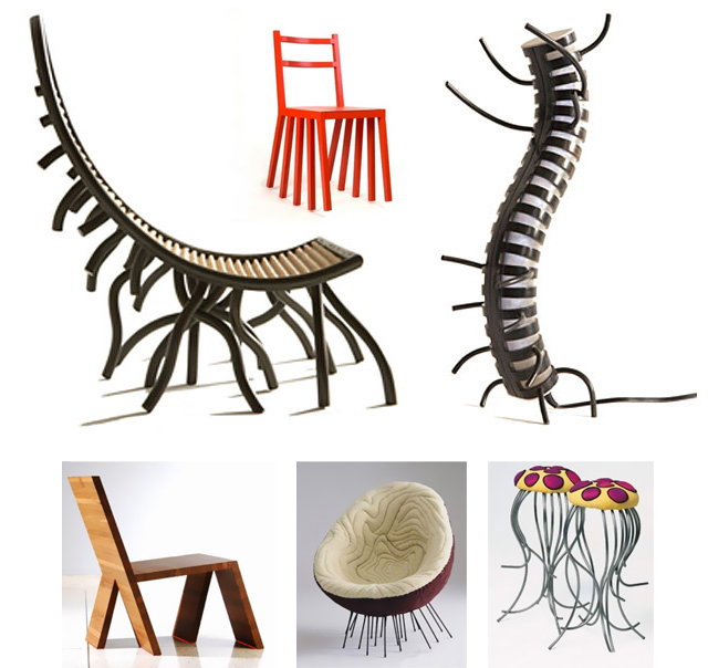
I don't think I need to write a long comment about these. My random collection of walking chairs. That's it.

Friday, 19 March 2010

Claire's Handmade Package Design

I the beautiful range of packaging for Claire's Handmade designed by London based design studio Simmer. The whole range is based on the same pattern (but what an amazing one!) and differentiated only by colour. The logo put emphasis ont he hands and therefore the fact that the products are handmade.

Claire's Handmade is one of the country's finest preservers, the chef-inspired products are exceptional. After delivering a brand health check we were appointed to work on the rebranding across identity, packaging, website, social media and marketing materials. New Claire's Handmade logo brings alive the design idea of "The Hands Of Creativity".


Mohodesign Carpets

MOHO DESIGN - Polish company established in 2004 that already became iconic. Their carpet collection won prestigious Red Dot Design Award in 2008 among many others, and was featured in Wallpaper magazine. The Dia carpet - the top two photos - is based on traditional Polish folk patterns and cut outs from the Kurpie region. Check out few more examples after the jump.


Tuesday, 16 March 2010

Limodesign - Monofobia Pillows

Amazing leather-like pillows with woman body printed on them. Squashed woman body. Quite intriguing. By polish studio limodesign.

Monday, 15 March 2010

Lauren Cahill - Unwanted Books

My friend's grandfather started a foundation taking care of unwated books. They redistributed the books among small schools libraries, sent the to the Polish people living abroad to cultivate the Polish language, offered them for sale in bulks, based on a chosen subject. I was raised to respect books and the written word so it's hard to throw out books, while there's so many coming my way I simply need to make space for new additions. I was thinking about all that looking at Laura Cahill's pretty amazing objects she'd created from old books....

My idea of using second hand books came around after doing research into common unwanted objects. One of the most common unwanted objects that can be found at either charity shops, car boot sales and sometimes on the streets are books. I discovered that the glue in old books make them extremely difficult to recycle. Aware of this I challenged myself to turn the second hand books that I had been collecting, into desirable objects such as furniture, lighting and ornaments.

UNIKEA

I'm sure all of you experienced the frustration you get when you can't assemble the IKEA furniture, even though their manual makes it look like the easiest thing in the world. My Dad actually put half of the sofa upside down once ...and didn't even notice. Even though he's an engineer! Well, here's a thought then - why not ignore the instructions and try to assemble the furnitre wrong, on purpose? Who knows where it's going to take you. Kenyon Yeh came up with some pretty amazing stuff...


Monday, 8 March 2010

Tukka Pillows For Children


These cute pillows for your little ones were designed by Ola Pronobis. Ola graduated from Fine Arts Academy in Krakow and her diploma project turned into an internet store and brand called Tukka. I hope the pillows are just the beginning of her design trip. Keeping my fingers crossed!

Plexiglass Furniture

Sipping my Saturday morning coffee, I was looking for some furniture options for my living room. A friend of mine suggested that I get transparent shelves made of plexiglass, which will create an interesting effect of books appearing on the walls out of nowhere, since you can really see the shelves themselves. While exploring the subject further more I discvered a polish company making beautiful furniture of out plexiglass. The armchair above is their lates feature, but I sure as hell will feature more of their work up to date later on.

Friday, 5 March 2010

Milimbo - Little Red Riding Hood


I the beautiful prints of Little Red Riding Hoodby Milimbo. Judging by the first picture, that little girl is somewhat evil, hiding in the forest with an axe... If you want her in your livingroom, you can order a print at their Etsy shop. via blackeiffel.

Little Red Riding Hood of Grimm brothers told in pictures (no text). In the introduction, there are an explaining about the meaning of the story.

Marimekko Handbags


I love Fridays. You wake up in the morning thinking about the weekend and things you're going to do on a Saturday morning. Today I'm off work for the most part of the day to sort out some administrative stuff, so I will walk the town (in snow, unfortunately), maybe stop for a coffee somewhere before returning to work.

I was painting my apartment yesterday and thinking of Marimekko. I'm going to have my white wardrobe wrapped in Marimekko's most recognizable pattern - Unikko. I can't wait to see how gorgeous it will look. Before that happens however, here's a few Marimekko bags  that I wish I owned.

Thursday, 4 March 2010

Malafor Design

There are so many paper tubes lying around in our studio. We have negatives delivered in them. The printing house we work with has diecuts delivered in them. And I never thought I could have them transformed into bookshelf or magazine holders! Just like the polish studio Malafor. I'm going to come back home tonight with a bag full of them and get the saw in action...

Wednesday, 3 March 2010

Harvest By Haroshi - Artwork From Recycled Skateboards

Believe it or not, all the items above have been made from recycled skateboards. Designed and made by Harvest By Haroshi they are currently a part of exhibition Skate and Destroy in Tokyo.
via Grafik Magazine and HUH Magazine.

Skate decks eventually see its life shortened by snapping, cracking and/or wearing out. Purchasing new decks is a never ending cycle and this was evident by the tower of old decks that were reaching to the ceiling of my room. We can’t throw away these decks because they hold sentimental meanings to us. I looked at these unusable decks every day and thought there must be something I can make with these.

I decided to make some accessories with the old decks and this was the birth of Harvest. The works of Harvest are through the perspectives of a skater and as an artist. As a skater, I want to take responsibility of reusing skateboards when they were no longer useable. Also, as an artist I want to explore the possibilities of what can be done with skateboards. We see the care and effort that a skater can have for his/her deck and we also acknowledge the origins of a skateboard. We believe that if the small things we do can connect to sustainability then we’re doing something right. We’d be satisfied in our effort when people look at products and start thinking of ways to recycle.


Tuesday, 2 March 2010

Joanna Rusin's Carpet Designs

I am in with the beautiful carpets by a Polish designer Joanna Rusin. Amazing mix of colours, textures, parts that are cut out... I have no idea where to buy them, but as soon as I figure it out I'll let you know. Stay patient.

Monday, 1 March 2010

Daily Typography Project By Jessica Hische


T he Daily Drop Cap is an ongoing project by typographer and illustrator Jessica Hische. It's a very short descrpition of the beautiful typography treats above. Jessica Hische, a wonderful illustrator, decided to follow a daily challenge of designing and posting one design of illustrated initial cap a day. Not only can you admire them at her blog, Jessica also provides a link to each cap, enabling you to embed it to your own blog or website. Just like the beautiful T at the beginning of this post!

Related Posts Plugin for WordPress, Blogger...